Are You Making Any of These 7 Compositional Mistakes with Your Still life Paintings?
By Will Kemp
https://willkempartschool.com/7-simple-compositional-tweaks-that-make-your-still-life-painting-100-more-professional/
Cherries overflowing perfectly in a bowl, a sense of life captured in a single moment, creating the perfect still life composition appears to come naturally to some artists.
Reassuringly, there are a few simple adjustments you can make to your own set-ups, that prevent you making the most common beginner mistakes.
By making small changes to the placement of your objects, you can breathe life and energy into your compositions and by observing how your viewing position impacts the shapes and shadows, will help develop accuracy in your drawings…
Set up #1: A Too Tight Crop
Beginner painters often focus too heavily on the object, even if it’s unintentional.
When you’re putting all your effort into the colour mixing and drawing of your still life, it can be easy to super-size your main subject.
This creates the illusion that the object is cramped onto the canvas and gives a claustrophobic feel. If you then have the addition of a thick frame, it can emphasise this problem even more.
When you set up a single object, try and start with around 50% of blank background space, this will give you a good starting point and give the subject some breathing room.
You can then extend the space – more space usually dictates a more contemporary feel.
You can then extend the space – more space usually dictates a more contemporary feel.
Then add extra elements.
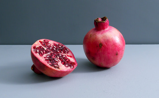
The simplest way to start with fruit, is to introduce more of the same or split the subject in half, this does a number of things:
- Creates a negative space between the objects
- Adds a different texture and scale
- Introduces a wider tonal range (think black pips in a pear next to the flesh)
- Brings a sense of timescale – the fruit has just been cut
- Adds a different shape to the shadows
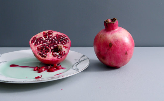
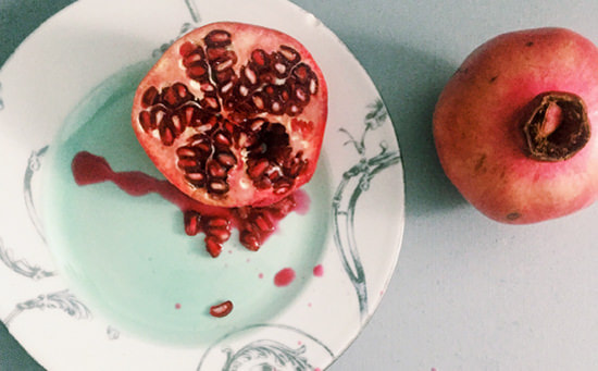
For more visual interest, extra objects can be introduced.
I tend to use things related to the subject matter in some way because it gives the painting a more natural story.
The plate brings in complementary colours, the subtle green next to the magenta of the pomegranate with an increase in tonal range from the white of the plate edge.
It also provides a nice surface for the pips to spill out onto.
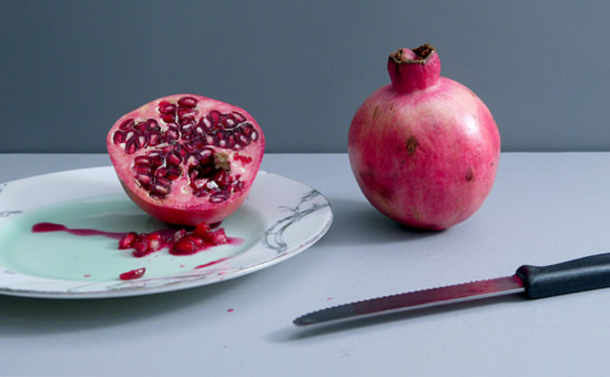
Utensils, such as spoons or knives, add compositional elements to guide the viewers gaze. Diagonal angles in any scene increase visual eye movement, so now we have a balance between the soft circular shapes of the pomegranate and the harder angular shape of the knife.
On reflection, I preferred the angle of the cut pomegranate in the images above when it was twisted slightly. From this angle, the face of the pomegranate is quite circular and similar to the shape of the whole pomegranate.
Whenever I’m working on a painting, I first take into account how the setup would work as a drawing.
The knife lying flat would create a too dark line to sit in harmony with the rest of the objects for the lighter tone of the piece that I want, so I propped the knife with a small piece of blue tac so the blade reflected the shine of the light source.
Set up #2: Misdirecting the Viewer’s Eye
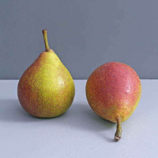
If you have too tight a crop combined with a strong downward directional angle, in this case, the stalk of the pear, it can guide the viewer’s eye off the bottom of the canvas rather than back into the centre of the scene.
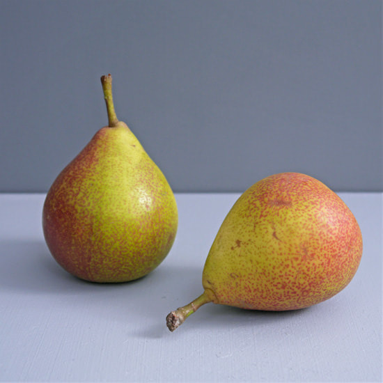
By twisting the pear, the stalk shape has a softer flow to it and the cast shadow has now been combined resulting in a more calming piece.
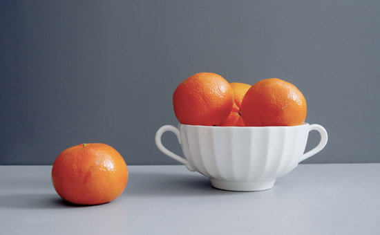
Set up #3: Too Many Even Shapes Creating a Solid Shape
Set up #3: Too Many Even Shapes Creating a Solid Shape
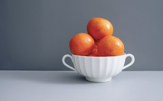
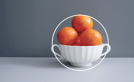
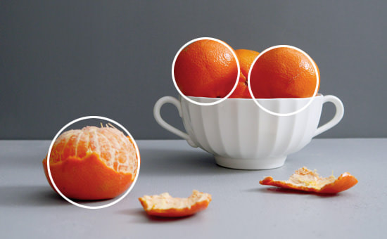
When you’re arranging a simple still life using a bowl of fruit, the tendency can be to just pile up fruit in the centre of the bowl. What this creates, from a distance, is a circular shape around the bowl and fruit on top.
It doesn’t offer any intrigue, even if you’ve painted each individual piece of fruit perfectly within the bowl, the viewer just sees it as one large block shape.
The easiest way to change the feel and add a level of subtlety is to take one of the pieces of fruit out of the bowl and place it in front of the main subject.
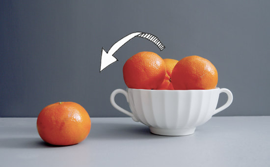
This gives space for the eye to move through and also a different variety of shapes on the top line of the fruit – breaking up the shape.
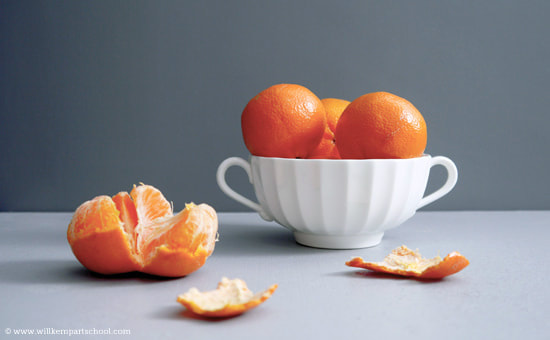
Protip: You get a bonus point if you noticed the angle of view and position of the bowl has changed slightly. The clue is in the lighter shape behind the cast shadow and the curve on the top of the bowl
Protip: You get a bonus point if you noticed the angle of view and position of the bowl has changed slightly. The clue is in the lighter shape behind the cast shadow and the curve on the top of the bowl
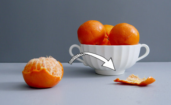
Peeling adds great texture, a different shape on the edge of the tangerine top and a human element to the composition.
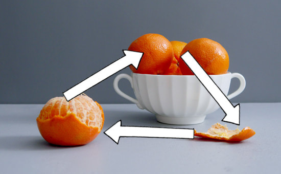
However, this has now created a uniform triangle flow between the objects, which is o.k ….but ideally, you want the eye to try and meander through the piece, adding something else will slow the eye
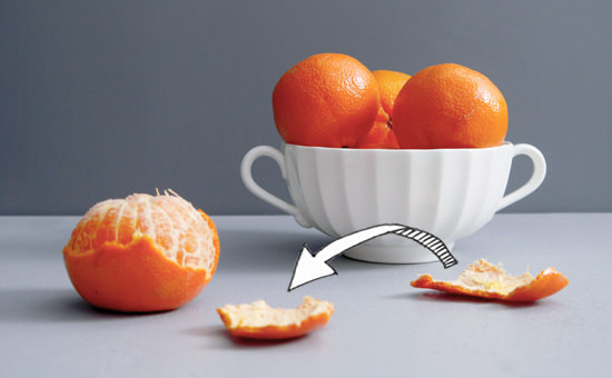
The next thing I notice is the shapes of the tangerines are all a bit samey, you’re always trying to achieve irregular shapes and gaps between objects.
Even shapes tend to stand out more in a painting, so if you notice them in your reference photograph, you’ll notice them even more in your painting.
Even shapes tend to stand out more in a painting, so if you notice them in your reference photograph, you’ll notice them even more in your painting.
Splitting the tangerine breaks the circular shape and reveals more interesting shapes in-between the segments.
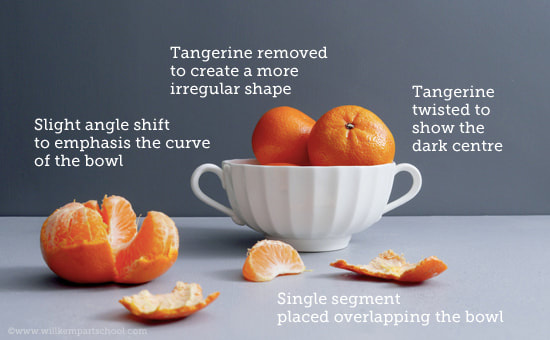
I then move some of the tangerines around to change the shape and show the dark centres, I’ve also elevated my viewing angle to reveal the inside of the bowl slightly.
The single segment adds a different sense of scale and overlap to the bowl, which helps create depth.
The single segment adds a different sense of scale and overlap to the bowl, which helps create depth.
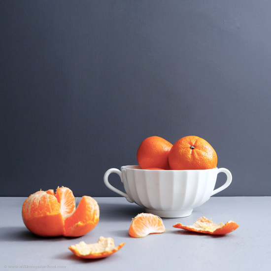
Set up #4: Imagining Ellipses – Eye-Level View of Jug Still Life
Some of the most common drawing issues tend to come from man-made objects.
Why?
Because any object that is round will create a curve or ellipse when viewed from any angle – and ellipses can be tricky!
The easiest way to think of an ellipse is to imagine squeezing a circle from the top and bottom.
The sides get wider, but there is still a curve to the edge of the shape, and this is the key.
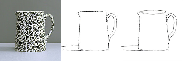
In the sketches above, the central drawing is an accurate representation of the photograph, in comparison to the drawing on the right-hand-side – which has been purposely altered to illustrate the most common mistakes.
The urge when drawing a jug (or cup) straight on, is to cheat a little.
Exaggerating what you can see inside the jug to make it look ‘more realistic’.
It’s very easy to find yourself sitting slightly taller in your chair to peak over the edge, but keep strong!
Even this subtle change in the top ellipse shape throws the drawing out.
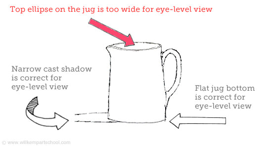
Key points to remember for an Eye-Level View:
- The bottom of the jug is very flat, there is still a slight curve at either end.
- Cast shadow is narrow
- You can’t see inside the jug
- The spout angles down at the top
-
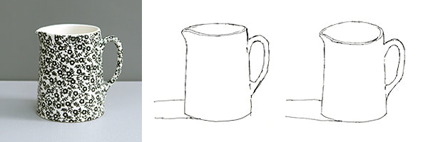
Now we’ve got a more classical view, a slight angle looking down into the jug, giving us a visible ellipse.
However, the exact same mistake can happen.
Even though you can now see inside the jug, the natural tendency is to try and show more.
So you make the top ellipse of the jug a little wider than before.
This drawing has the most subtle differences from the correct drawing to the over exaggerated ellipse, but it still gives us a strange perspective.
From this more elevated angle there are a couple of other changes in comparision to the flat on view that are visible in the reference image:
- The cast shadow has grown wider
- The curve has increased on the bottom of the jug
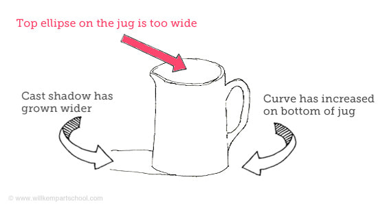
Key points to remember for an Elevated View:
Drawing Ellipse EdgesFor jugs and cups, it tends to be the exaggerated viewing angle that causes the most issues.
For plates, it’s the very edge of an ellipse, or more specifically, the lack of edge in an ellipse shape.
When you’re drawing a plate the tendency is to start on the left and then draw the curve on the top.
Then, from the same starting point, draw the bottom half of the plate. This gives you an angled point at each end of the plate.
- The bottom of the jug is much more curved
- Cast shadow is wider and the angle changes relative to the position of the light source
- You can see deeper inside the jug
- The handle shape has changed (a little)
Drawing Ellipse EdgesFor jugs and cups, it tends to be the exaggerated viewing angle that causes the most issues.
For plates, it’s the very edge of an ellipse, or more specifically, the lack of edge in an ellipse shape.
When you’re drawing a plate the tendency is to start on the left and then draw the curve on the top.
Then, from the same starting point, draw the bottom half of the plate. This gives you an angled point at each end of the plate.
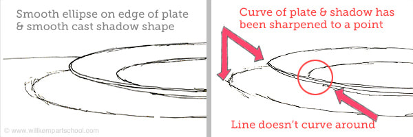
Subconsciously this can then alter how you draw the cast shadow.
On the drawing on the left, the cast shadow is a smooth curve, whereas, on the drawing on the right, the shadow curve echoes the shape of the plate which further emphasises the point.
You might also find some drawings have a combination of both of the issues, increasing the perceived amount of the plate surface you can see (widening the ellipse) and emphasising pointed edges.
Have a look back at some of your still life drawings or paintings and see if you can spot any of these mistakes that can be easily tweaked.
