Portraits
Content Objective . . . Students will paint a portrait of themselves or someone they know including clues that give insight to that persons character or interests.
Language Objective . . . Students will use descriptive vocabulary related to facial features, emotions, and symbolic elements in portraiture (e.g., expression, gesture, posture, symbolism, color psychology)
Language Objective . . . Students will use descriptive vocabulary related to facial features, emotions, and symbolic elements in portraiture (e.g., expression, gesture, posture, symbolism, color psychology)
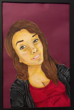
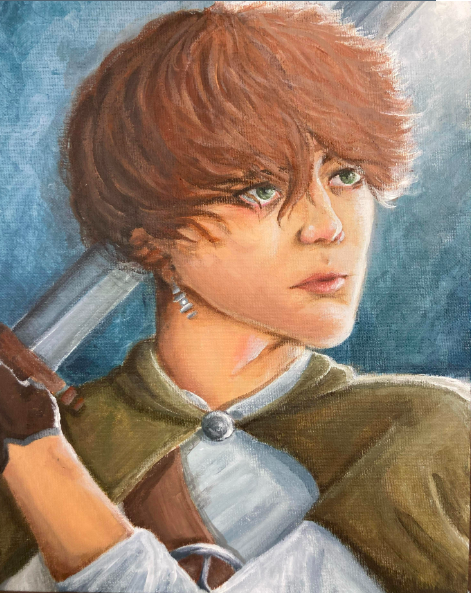
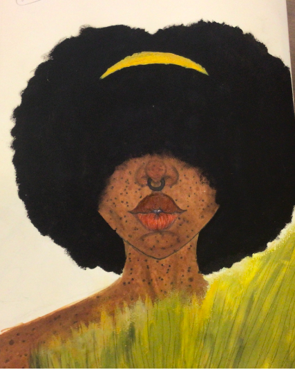
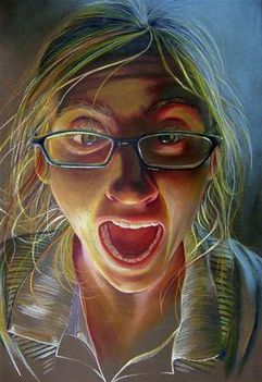
ALEXIS G., JCHS Student
|
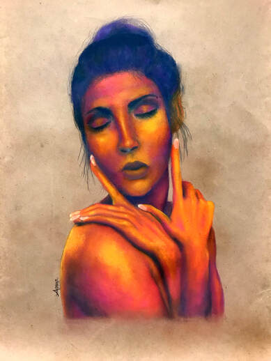
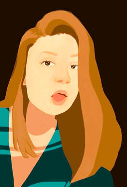
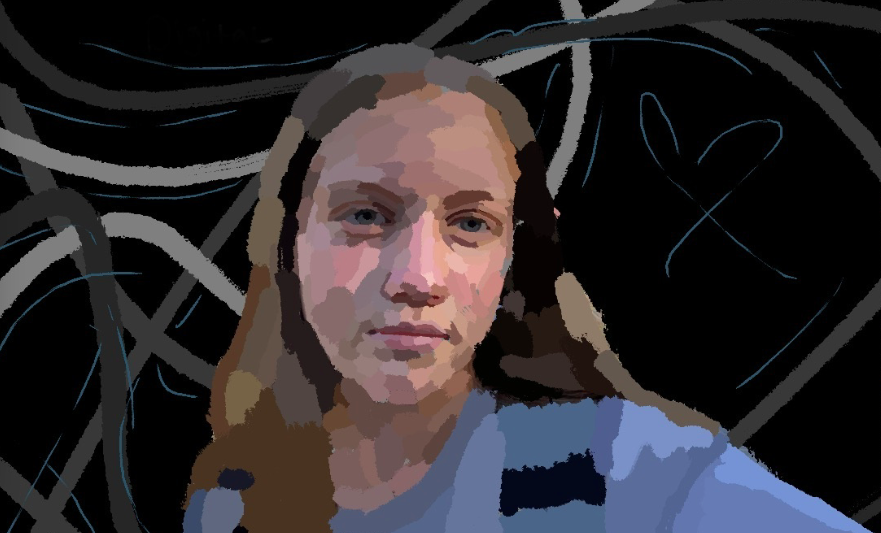
ADRIANA M, JCHS Student,
|
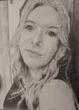
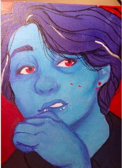
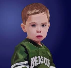
EMILY R., JCHS Student
|
KARA S. JCHS Student
|
BREE W. JCHS Student
|
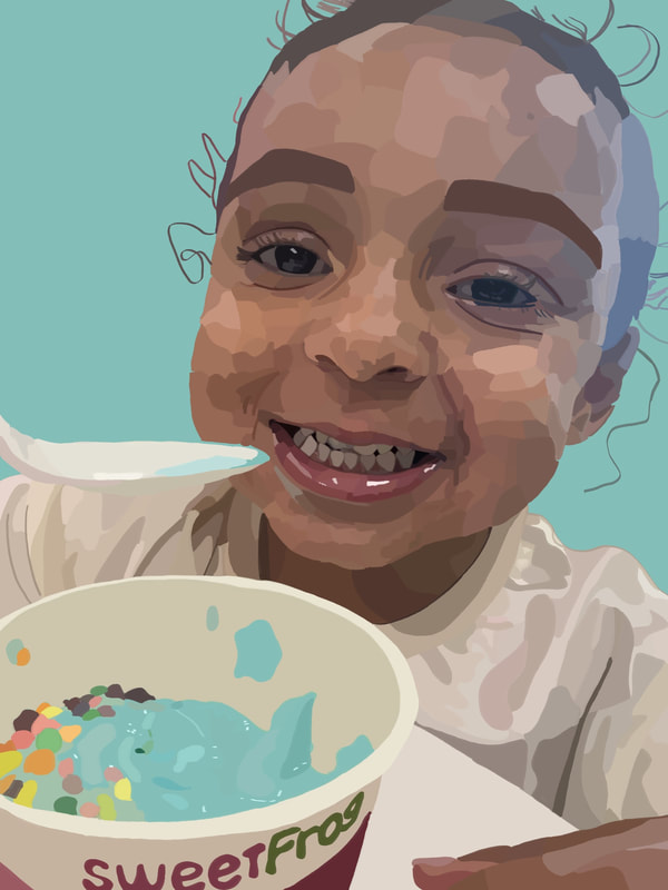
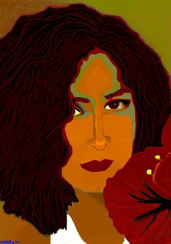
ISABELLA J. Digital Art, JCHS Student
|
ALYSSA F., JSCH Student
|
ISAI G-S, JCHS Student
|
JULIANNA H. JCHS Student
|
KAYLA C. JCHS Student
|
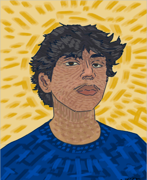
Andrew C., JCHS Student
|
|
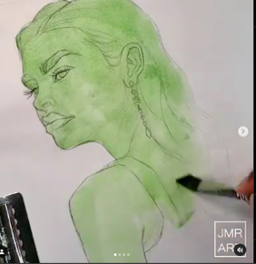
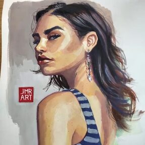
# jmr_art
https://www.instagram.com/p/BwzkisQl0Oe/?img_index=1 "Why start with green? I like to do this to get rid of the white of the paper mainly. Having a color already down helps me know how thick to make the paint mixture when layering on top. Green also helps to tone down the reds a bit as the complimentary color". Gouache Paint |
|
|
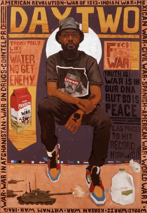
What is Narrative Art
Narrative art tells a visual story encouraging the viewer to want to seek more information or ask questions about what is happening in an artwork. Since the image is a snapshot in time, the viewer uses their imagination to interpret the story. The artists isn't trying to make a completed narration leaving the viewer to get creative with what they believe is happening. While planning what to include in their work, the artist asks themselves questions like who will be included in the piece and what is happening before or after this point in the "story".
http://www.backslashgallery.com/riley-holloway
|
Riley Holloway
https://www.rileyholloway.com/about Holloway is best known for his dynamic work and fresh look at figurative art. His images are often accompanied by text and personal references embedded within the work. Holloway uses a traditional oil painting technique and bold lines to create depth within the portraits. There is a wonderful counterbalance of softness and masculinity seen in the works. Holloway’s aesthetics create familiar spaces that are rich in storytelling, free from constraints, and true to his subjects. His content is rich in drama, history and intimacy. Artist Statement"My work begins with the individual. I've always been an observer of people and run into individuals who inspire me through their fashion, personality, or conversation. I am for creating pieces that are rich in storytelling, free from constraints, and true to the person I'm painting. This is accomplished by letting the individual's narrative drive my work. I use traditional drawing and oil painting techniques to communicate the qualities of each individual". |
ESTIMATED PROJECT LENGTH; 10 DAYS
When you have completed this project, submit a photo of your finished artwork on Canvas.
|
Overview
Create a narrative portrait of yourself or someone you know Your portrait should focus on the head and shoulders although other parts of the person can be included Take your own reference photo(s) Use the grid method to transfer your drawing from the photo to your art surface |
Media Suggestions
Mixed Media Graphite Gouache Digital |
Jumpstart Prompts
Having trouble coming up with an idea? Below are three inspirational ideas that you can make yours. You may, of course, come up with your own idea for this project, but these are available if you need some help.
Having trouble coming up with an idea? Below are three inspirational ideas that you can make yours. You may, of course, come up with your own idea for this project, but these are available if you need some help.
|
Secondary Surface Treatment
|
Touch of Color
|
A Nod to Pop Art
|
https://www.miamidesignagenda.com/
wpcontent/uploads/2016/03/THE-BEST-ART-GALLERIES-PALM-BEACH-6.jpg
|
https://www.studentartguide.com
/featured/creative-portraiture-a2-coursework
|
https://i.pinimg.com/originals
/69/2c/13/692c1393
f47e9d5fa9daba95612d9931.jpg
|
|
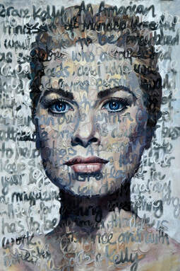
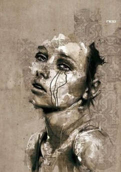
Secondary Surface Treatment - Add a second layer on top of your portrait that relates to the person in your artwork. This can be words or images. The painting above has semi-transparent words covering the entire sure face that describe the person being painted, Grace Kelly.
|
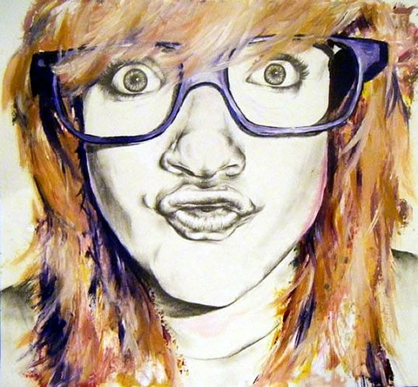
Pop of Color - Create a drawing from graphite or black ink then choose one or two areas to add color. A variety of media can be used for the color like watercolor, acrylic, colored ink, gouache, pastel or colored pencil. Color application should not over power the face.
|
https://www.miamidesignagenda.com/wp-content/uploads/2016/03/THE-BEST-ART-GALLERIES-PALM-BEACH-6.jpg-
A Nod to Pop Art - Pop Art was an art genre that glorified popular culture. Two of its most famous artist are Andy Warhol and Roy Lichtenstein. They created art using printmaking techniques, bright colors, and comic book styles. Use flat planes, minimal shading, texture, and color halos to create your portraits. |
Please download the form and complete it on Day 1 of the project.
|
TAKING THE PHOTO 1. Interesting Lighting- Strong or soft, flattering or harsh, moody or dramatic, diffused 2. Good Composition - Unusual Angles, Off-Center, 3. Emotion, Mood or Story - Things in the Photo, Lighting, Exposure, 4. Background - Sharp/Focuses or Blurry/Soft, dark or light, complements or distracts, nonexistent 5. Cropping 6. Unique and Powerful |
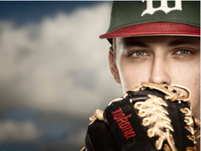
TODD SPOTH https://500px.com/toddspoth
|
PHOTOGRAPHY WEBSITES
8 Posing Guides to Inspire Your Portraiture
10 Ways to Take Stunning Portraits
How to Take Great Portrait Photos
8 Posing Guides to Inspire Your Portraiture
10 Ways to Take Stunning Portraits
How to Take Great Portrait Photos
PORTRAIT PHOTOGRAPHERS
Gregory Heisler Diane Arbus. Eve Arnold. Brian Ingram
Edouard Boubat Dorothea Lange Annie Leibovitz.
Gregory Heisler Diane Arbus. Eve Arnold. Brian Ingram
Edouard Boubat Dorothea Lange Annie Leibovitz.
GRID DRAWING
Artists have been using grids to create accurate drawings for hundreds of years. Basically a line gird is placed over a photo and a second grid is lightly drawn onto the final surface of the artwork. Both grids have the same amount and configuration of squares. The artists transfers the lines and shapes from individual squares on the photo to the corresponding squares on the art surface drawing them exactly where they touch the edges of the box. Each box is treated as an individual drawing. If the artists wants to enlarge the image, the art surface grid is drawn larger using the same amount and placement of squares. Once each square is transferred, the grid is erased leaving the finished drawing.
In the past, the artist would use a ruler and pencil to grid off the photo. Today, photos can be uploaded to an online site that will grid the photo for the artist. The artist will still need to use a ruler and a pencil to create the grid on the art surface.
Before Beginning this project, please go to the Grid Drawing Tool Website and watch the video with detailed instructions. After watching the video, follow the directions to upload and grid your photo. There is a link to the video below if the video is blocked on the website
Grid Tips
- A grid that is too simple will not be as accurate as one with more squares
- You will need to double or triple the size of the squares on the art surface since the photos will be printed on copy paper
- It is easier to adjust the size of the art surface rather than the grid
- DRAW THE GRID AS LIGHT AS POSSIBLE - dark lines are hard to erase, leave indents in the art surface, and will show on the finished product
Skin Tone
Video Resources
Proko Youtube Videos
Here are a few videos from Proko, but there are many more available.
Proko Youtube Videos
Here are a few videos from Proko, but there are many more available.
LOOMIS METHOD
Drawing the Head and Hands, Andrew Loomis Book (PDF)
Head Proportions Demonstration with Max Baumgardner
Drawing the Head and Hands, Andrew Loomis Book (PDF)
Head Proportions Demonstration with Max Baumgardner
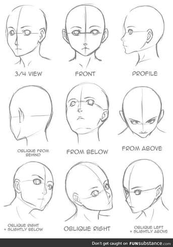
VIEW POINTS
FRONTWARD FACING https://drawinglics.com/photos/6/pencil-drawings-by-leong-hong-yu-beautiful-artworks-and-natalie-drawings.py
|
THREE QUARTER VIEW https://drawinglics.com/photos/47928/realistic-drawing-tips-and-techniques-how-to-draw-realistic-realistic-drawing-tips-and-techniques-how-to-draw-realistic-portraits-youtube-art-drawings-with-tutorials-pinterest-realistic-drawings-and.py
|
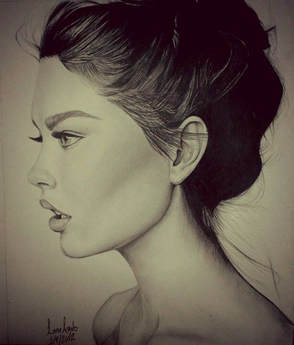
PROFILE
https://drawinglics.com/photos/97131/to-live-is-the-rarest-thing-in-the-world-most-people-exist-that-explore-pencil-art-drawings-face-drawings-and-more.py
|
http://funsubstance.com/fun/311194/how-to-draw-a-head-i-guess/
|
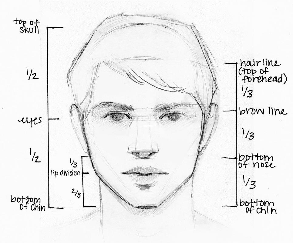
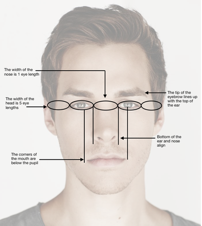
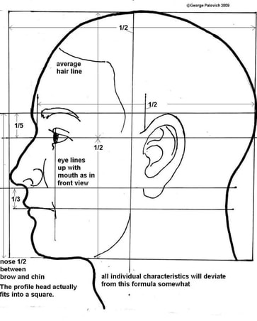
DIVISION OF FEATURES
|
There are 2 common ways to divide the face so that major features are placed in the correct position.
Full Head
Hairline (Top of the Forehead) to Chin Divide from hair line to chin into 1/3 rds
Most new artists tend to put the eyes too far up on the face. |
|
http://purchasepawprints.blogspot.com/2012/03/yearbook-artwork.html
|
http://www.wetcanvas.com/forums/showthread.php?t=937964
|
THE PROPORTIONS ABOVE ARE GENERAL GUIDELINES. PROPORTIONS VARY & SHOULD BE DRAWN AS OBSERVED.
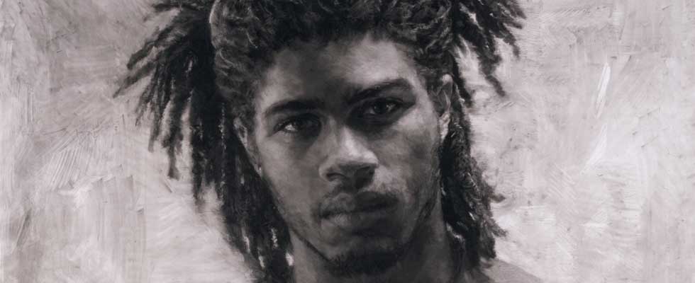
Portrait Examples
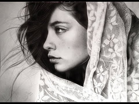
GRAPHITE https://www.youtube.com/watch?v=4vv4NTZ-NXA
|
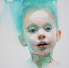
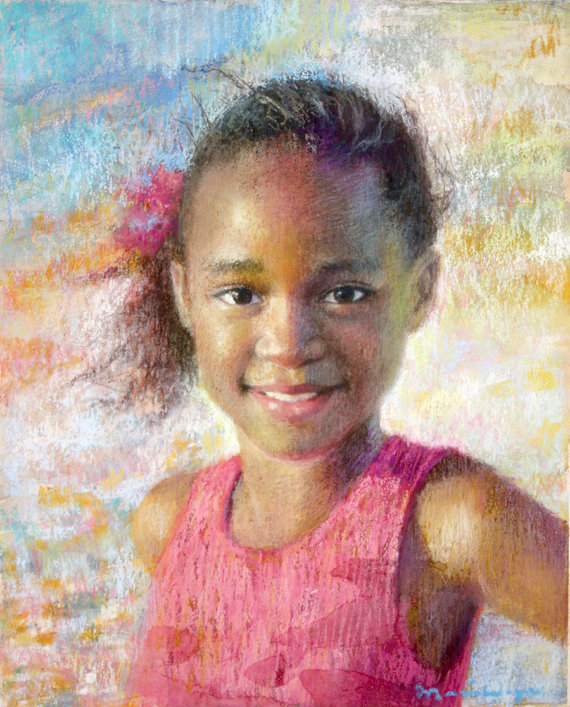
WATERCOLOR https://www.trendhunter.com/trends/innocence-of-childhood
|
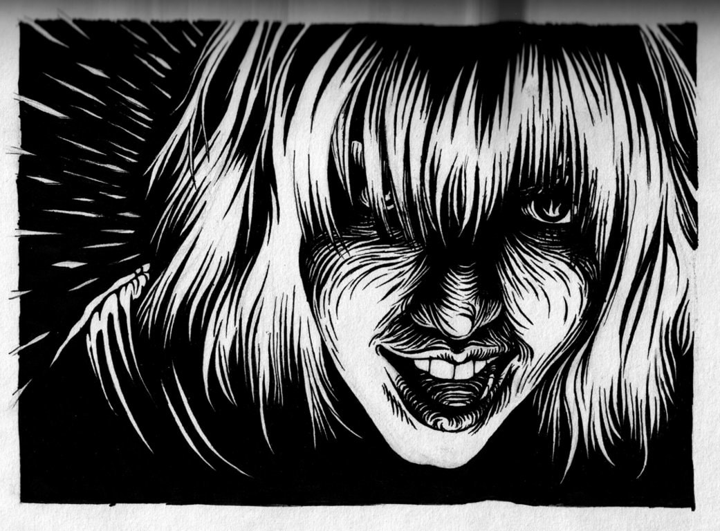
PRINTMAKING https://konstantinek.deviantart.com/art/Linoleum-Block-Print-Prelim-27568041
|
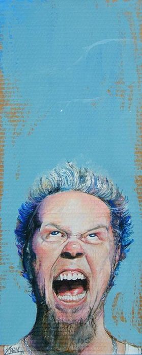
GOUACHE http://www.mariapicasso.com/painting-james-hetfield-portrait/
|
PEN & INK https://www.artpal.com/zianstudio
PASTEL https://www.etsy.com/uk/listing/97444371/custom-portrait-painting-pastel
|
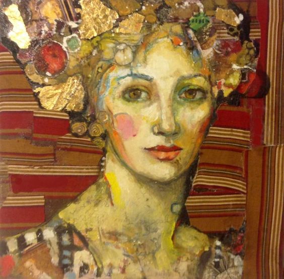
ACRYLIC https://www.artfinder.com/product/june-in-stripes-and-gold/?utm_campaign=product-june-in-stripes-and-gold-share-pinterest&preview=1&utm_medium=pinterest-share&utm_source=artfinder#/
COLORED PENCIL http://www.artandwriting.org/explore/online-galleries/
|
MIXED MEDIA https://www.dailyartfixx.com/2010/08/02/daf-group-feature-vol-16/iris-florian-nicolle/
|
CHARCOAL http://npg.si.edu/exhibit/drawing/borgman.html
|
