Negative Space
https://www.tes.com/lessons/YG94R01jGPZluQ/negative-space
Write the following Definition in your sketchbook
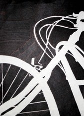
Positive space is usually the main subject or shape in the image - the figure.
Negative space is the area around it – the background.
https://artdocents.wordpress.com/2013/11/12/positive-negative-space/
When we create a drawing or a painting, typically we look at the positive space or the items that make up the composition. Negative space is the space between objects or essentially the background. Sometimes you can tell just as much about a subject by looking at the negative space as the positive space. The absence of information is still information. There are 4 major benefits to drawing negative space (write the 4 benefits in your sketchbook).
- Drawing negative space is a right brain activity because our brain is unable to recognize and name what we are drawing. It is a great way to strengthen our creative skills and improve our abilities to see forms and shapes.
- Negative space drawing also helps us to draw complex objects or groups of objects.
- By comparing the negative space of the subject to the negative space in our drawing, we are able to judge the accuracy of our work. If the shape of our negative space varies from our subject, our drawing is incorrect.
- By balancing negative and positive space, we are able to create more interesting compositions. Many artists choose to have an equal about of positive and negative space.
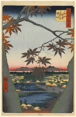
Composition using Negative Space - Utagawa Hiroshige (Ando) (Japanese, 1797-1858). Maple Trees at Mama, Tekona Shrine and Linked Bridge, No. 94 from One Hundred Famous Views of Edo, 1st month of 1857. Woodblock print
https://www.brooklynmuseum.org/opencollection/objects/121708
|
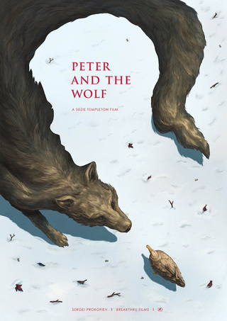
Phoebe Morris created this negative space poster design for a film version of Sergei Prokofiev's 'Peter and the Wolf'.
http://www.creativebloq.com/art/art-negative-space-8133765
|

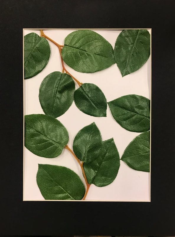
Negative Space Mini project 1
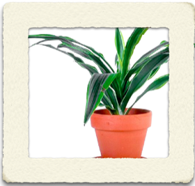
For this mini project, you will be observing and drawing the negative space around the plant at the front of the room.
Goal Setting: You will be setting 2 goals for this project. The goals are listed below. Please write the goal and your response in your sketchbooks. You will be asked to assess how well you met your goals when you fill out your self assessment at the end of the project.
Goal 1 (Time Management); To stay on task and complete the assignment, I will . . .
Goal 2 (Craftsmanship): One thing I would like to accomplish with the oil pastels is . . .
|
Viewfinder
In order to help you find and see the negative space, you will be using a viewfinder.
|
|
|
|
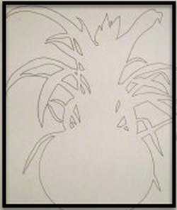
Draw the Negative Space
Rough Draft
|
|
|
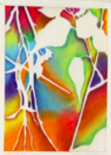
Add color to the negative space
|
Negative Space Mini Project 2
For this mini project you will be using either your first or last name initial (first) letter to create 3 negative and positive space designs.
Goal Setting: You will be setting 2 goals for this project. The goals are listed below. Please write the goal and your response in your sketchbooks. You will be asked to assess how well you met your goals when you fill out your self assessment at the end of the project.
Goal 1 (Craftsmanship): Looking at cutting and gluing, I would like to improve . . .
Goal 2 (Design): In order to balance my Negative and Positive space , I will . . .
Designing the Letter
- You may choose one of your initials
- Study fonts for design ideas. The letter design should be detailed and somewhat complex. Below are some links to online font foundries. Cursive and Gothic letters are good examples of the type of font that works well for this project.
- The letter may be slightly abstracted rather than perfectly aligned to the original font.
- Choose letters in which the lines or strokes vary in thickness and are not straight and parallel
- Avoid fonts that use extremely thin stokes since these will be difficult to cut out of paper.
- Complete 3 small quick drawings on one piece of paper using 3 different fonts. Turn into Schoology
- Choose your favorite font for your final design. Color a box around the letter to see how it will look finished. To see what your design will look like in the reverse values, go to lunapics.com. Use the Negative filter to create a reverse value image.
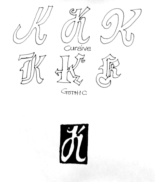
Quick Sketches and Shaded Test Block
|
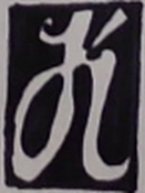
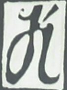
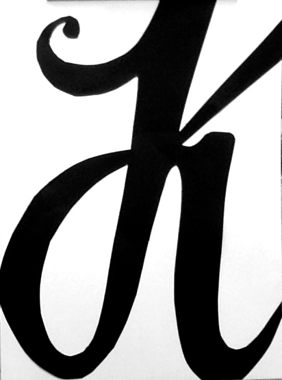
Image Negative
|
Creating Your Template
- You will make your final design to scale (the size of the final) and it will be used to create the 3 final pieces.
- Final paper size is 9" x 12"
- The letter should touch or almost touch each of the 4 sides of the paper
- You may embellish your letter (ex: creating a scalloped edge down one side of the letter or cutting accent circles down the middle of a stroke)
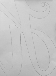
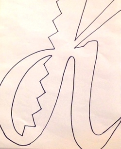
Original Design
Traced Backward on the White Paper
|
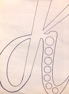
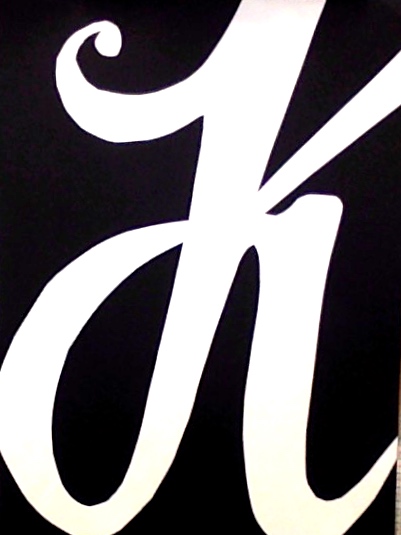
Embellished Design #1
|
Embellished Design #2
|
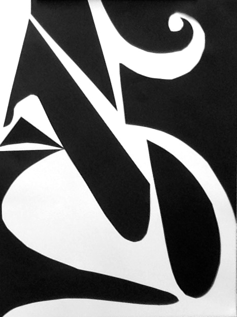
Final Design
- You will be using black and white construction paper for your final design
- Begin with the white paper. Transfer your rough draft to the final paper using a light box. Flip the rough draft upside down and put the white piece a paper on top. Both pieces on the light box and LIGHTLY trace your design. By tracing and cutting the letter upside down, you will avoid seeing any pencil lines.
- Once the design is transferred, place a piece of black construction paper underneath the white paper with your transferred design.
- Carefully cut out your letters cutting through both the black and white paper starting at an area where the letter touches the edge of the paper.
- Don't cut through the negative space to reach the letter. We will be using the scraps around your letter form for the last piece.
- If you have an interior area that can't be reached with scissors, use an X-acto knife to start the cut. You may finish it with scissors or continue to cut out the shapes. Save all of your pieces.
- Your white letter will be glued onto the black paper and the black paper will be glued to the white paper. That will complete your first 2 images.
- The final image will be created using the negative space pieces around the letter, but not the letter itself. You may choose either the white or black pieces which will be glued on to paper of the opposite color.
- Rearrange the pieces to create a new design. You can't reassemble the pieces in the same places. You must use all of the pieces and you need to balance the areas between dark and light.
- Design tips - Don't place any lines so that they run directly into a corner. Try creating small areas of interest by bringing lines together. Create paths through the piece so that major areas are not blocked from each other. Don;t overlap any of the pieces and fit them inside the paper edges.
- We will mount all three pieces side by side to create one finished piece.
|
|
|
Take a photo of the finished work and turn it into Schoology.
