ASK THE ART PROF: HOW DO YOU COMPOSE AN ARTWORK MORE RICH WITH DETAILS THAT WILL CATCH THE EYE?
CLARA LIEU
April 10, 2013
https://claralieu.wordpress.com/2013/04/10/ask-the-professor-how-do-you-make-an-art-piece-more-rich-with-details-that-will-catch-the-eye/

“I have a question about composition, how do you make an artwork more rich with details that will catch the eye?”
Details are what dazzle and impress viewers in an artwork, they’re basically the fireworks at the end of an event. However, what many people don’t realize is that details can only successful if they are supported by a strong composition. Without the structure of a compelling composition, details will fall apart and lose their context. Composition is undoubtedly one of the most important aspects of making art, but unfortunately it is one fundamental skill that is notoriously overlooked.
Seduced by details, many artists will place far too much emphasis on specifics in the early stages of a work when really they should be concentrating on the composition. It doesn’t matter how amazing your details are if you have a lousy composition, so don’t even think about details until your composition has been solidified. (For more information about how to sketch compositions, read this article I wrote about preliminary sketching.)
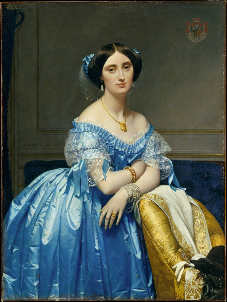
The French neo-classicist painter Jean Auguste Dominique Ingres is renowned for his astonishing detail in his oil painting portraits. He painted details that seem virtually microscopic in the textures of the clothing, hair, and lace in his artworks. Most people are enthralled by the extraordinary level of detail in his paintings. They don’t take the time to recognize that the choices he made in the composition of his painting contribute just as much, if not more, to the effectiveness of the piece as the details do.
Details are what dazzle and impress viewers in an artwork, they’re basically the fireworks at the end of an event. However, what many people don’t realize is that details can only successful if they are supported by a strong composition. Without the structure of a compelling composition, details will fall apart and lose their context. Composition is undoubtedly one of the most important aspects of making art, but unfortunately it is one fundamental skill that is notoriously overlooked.
Seduced by details, many artists will place far too much emphasis on specifics in the early stages of a work when really they should be concentrating on the composition. It doesn’t matter how amazing your details are if you have a lousy composition, so don’t even think about details until your composition has been solidified. (For more information about how to sketch compositions, read this article I wrote about preliminary sketching.)
The French neo-classicist painter Jean Auguste Dominique Ingres is renowned for his astonishing detail in his oil painting portraits. He painted details that seem virtually microscopic in the textures of the clothing, hair, and lace in his artworks. Most people are enthralled by the extraordinary level of detail in his paintings. They don’t take the time to recognize that the choices he made in the composition of his painting contribute just as much, if not more, to the effectiveness of the piece as the details do.
Jean Auguste Dominique Ingres
Below is a list of three primary objectives to consider when composing a piece, followed by concrete actions that you can take to get those results.
1) Lead the viewer’s eye to continually move throughout the work
A strong composition should get your eye continuously moving from one place to the next. Your eye should bounce from top to bottom, side to side, and inhabit every single piece of the composition at some point. Avoid placing your subject matter in the center of the piece, as this isolates all of the visual activity to the middle of the page. In general, symmetry also makes for a less engaging composition because it’s predictable and too consistent. Let your composition surprise your viewers.
2) Make every part of the artwork important
I had a piano teacher who used to say “make every note special“. It seems like an impossible task when you think about how many notes are in a piece of piano music, but the point is that every note in a piece of music has it’s own special role to play within the delicate balance of a work. Assign roles to different parts of your work so that some are large and dramatic, whereas others are quiet and subtle. A composition won’t work if everything is big and loud. Fabricate sections of the composition to contrast against the rest. All of the parts of your piece should work together and feed into an intricate web of relationships. Have your composition so complete and tightly woven that the removal of even one section would cause the balance to fall to pieces.
3) Be visually dynamic
Keep things visually exciting in every moment in your composition. One concrete action you can employ to make this happen is to implement diagonals anywhere you can. Diagonals fabricate a sense of action and movement, whereas horizontals and verticals tend to appear static and stiff. Cropping your subject matter can also make the image appear grander and more dramatic. Leaving the entirety of your subject matter confined to the four edges of the page feels stale and boring.

Gericault, “The Raft of the Medusa”
I’ve always felt that Gericault’s painting “The Raft of the Medusa” is one of the most striking compositions ever made. This piece is an astonishing 193″ x 282″ with life size figures, (make sure to see it in the Louvre in Paris before you die) and is propelled by it’s remarkable composition. If you examine the piece, it’s essentially a series of diagonals that slice up the composition very dramatically. With their thrashing limbs and desperate gestures, each figure points and leads to another, ending with a climactic finale in the figure at the top waving a rag. There are quiet movements like the soft transitions in the sky, contrasted by brutally dark and powerful forms in the human figures. All of these areas work together to create a boldly balanced composition that Gericault’s horrific details flourish within.
Once you have a strong composition set up, you’re ready to tackle details. Be selective about where you put details, and distribute them sparingly throughout your composition. Too many details in a piece can make a composition feel cluttered. You don’t want to create a situation where the details are constantly competing for a viewer’s attention. Allow for large, ambiguous areas in your composition where the eye can rest temporarily. Think about details as little treasures that are to be discovered when looking at a piece.
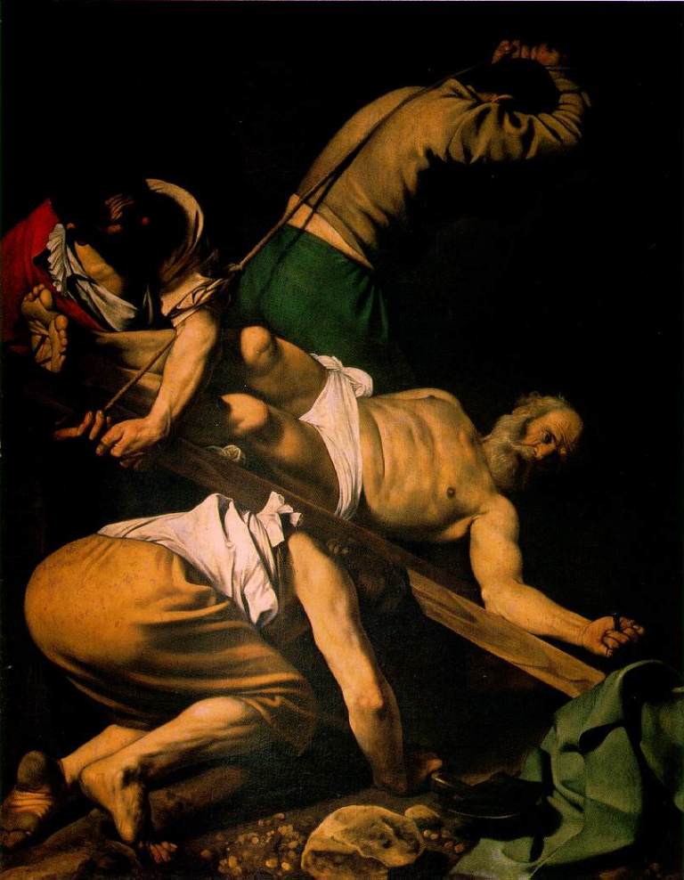
Caravaggio, The Crucifixtion of St. Peter
In this Caravaggio painting above, one of my favorite details is the pair of feet in the lower left hand corner. Not only does Caravaggio paint the veins and skin folds of the feet with intense detail, but he takes the time to paint the dirt on the feet! The simplicity of the dark, shadowy background around the feet allows these details to emerge beautifully. Not only is this detail stunning, but it also provides a visual description that enhances the depth of the narrative.
In this Caravaggio painting above, one of my favorite details is the pair of feet in the lower left hand corner. Not only does Caravaggio paint the veins and skin folds of the feet with intense detail, but he takes the time to paint the dirt on the feet! The simplicity of the dark, shadowy background around the feet allows these details to emerge beautifully. Not only is this detail stunning, but it also provides a visual description that enhances the depth of the narrative.
