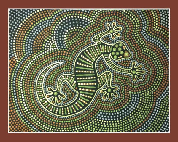
ABORIGINAL ART
https://www.flickr.com/photos/
veramilo/7492343632/
|
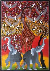
Tinga Tinga Painting
http://onecrayolashort.
blogspot.com
|
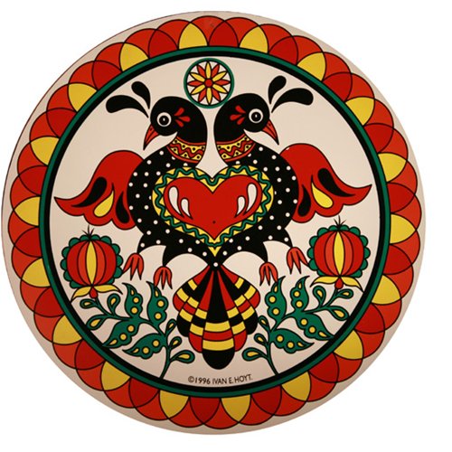
Pennsylvania Dutch Hex
https://owlcation.com
/humanities/Dutch-Hex-
Sign-Style-Guide
|
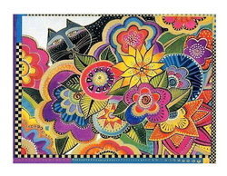
CLOISONNE ANIMAL
http://ru.aliexpress.com/w/
wholesale-laurel-burch.html
|
Folk Art Characteristics Choice Projects
Essential Question: How does folk art reflect the shared human experience across many cultures?
I Can:
Choice 1
I Will:
Choice .2
I Will:
Choice 3
I Will:
Choice 4
I Will:
I Can:
- list common characteristics found in folk art from different cultures.
- recognize the role that the environment, traditions, religion, and culture plays in folk art.
Choice 1
I Will:
- choose characteristics from Aboriginal Art
- create an Aboriginal Dot Painting
Choice .2
I Will:
- choose characteristics from African Tinga Tinga Paintings
- create a Tinga Tinga Painting
Choice 3
I Will:
- choose characteristics from the Pennsylvania Dutch Hex
- create a cardboard hex
Choice 4
I Will:
- choose characteristics from all Folk Art
- paint an animal painting based on cloisonné and the work of Laurel Burke
Overview
This set of art pieces consist of 4 different art projects centered around the common characteristics found in all folk art regardless of the culture where it originated. You may choose one project to compete. Before deciding, please read over the directions for all 4 projects. Some common threads found in multiple cultures include: Colors, Patterns, Nature Inspired, Materials Used, Subject Matter etc.
Please read, watch and/or complete the following information about color mixing before reviewing your project options. We will be painting a lot both on this project and others. This will help you to get the results you need.
Please read, watch and/or complete the following information about color mixing before reviewing your project options. We will be painting a lot both on this project and others. This will help you to get the results you need.
Color Mixing
Color Mixing Quick Lab Video
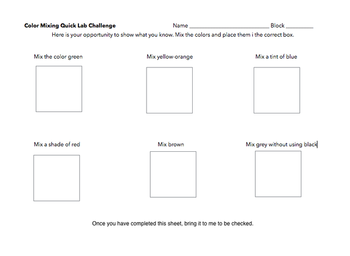
Watch the Color Mixing Quick Lab Video by clicking on the link below. This will give you a quick overview of how to mix colors. Once you have watched the video, complete the color mixing challenge to show what you have learned. Get the challenge painting sheet at on the table below the Promethean Board. Once you have completed the challenge, photograph the worksheet and turn it into Schoology. Below is an image of the challenge you will be completing.
Submit a photo of your lab in Canvas under Color Mixing Lab
Color Theory Vocabulary
- Analogous Colors: Colors that are closely related to each other because a common color can be found; for example: blue, blue-violet, violet etc. These colors touch on the color wheel.
- Color: An element of art defined as the effect of light reflecting from an object onto the eye.
- Color Scheme: A planned combination of colors
- Color Wheel: Shows what happens when colors are mixed and explores relationships between colors
- Complementary: Two colors on opposite sides of the color wheel. They intensify each other when next to each other and make brown shades when they are mixed together
- Cool Colors: Blue, green and violet. Cool colors suggest coolness and seem to recede from a viewer. Cool colors can be used as a color scheme. Opposite of warm colors.
- Double Split Complementary: Choose a complementary color set and use the four colors on both sides of the complementary colors, but not the complementary colors themselves
- Intensity: Refers to the brightness or dullness of a color; amount of saturation.
- Monochromatic: A color scheme that uses only one hue and the tints and shades of the hue.
- Neutral: Black, white, gray and variations of brown. Often these colors are called earth colors.
- Primary Colors: The basic colors that can't be reduced into component colors and can be used to mix all other colors.
- Secondary Colors: Colors made by mixing two primary colors. When red, yellow and blue are used as primary colors, the secondary colors are orange, green and violet.
- Shade: A dark color achieved by changing the value of a color by adding black.
- Split Complementary:One hue and the hues on each side of its compliment on the color wheel. Red-orange and blue and green are split complementary colors.
- Tertiary: A color made by mixing a primary color and a secondary color. Intermediate colors is another name for tertiary colors.
- Tint: A light color achieved by changing the value of a color by adding white.
- Tone: A color mixed with black and white, a grayed color.
- Triadic: A triadic color scheme uses colors that are evenly spaced around the color wheel.
- Value: An element of art that describes the relative lightness or darkness of a color.
- Warm Colors: Red, orange and yellow. Warm colors suggest warmth and seem to move toward the viewer. Warm colors can be used as a color scheme. Opposite of cool colors.
Color Scheme Generators
There are a lot of online resources that help artists choose color schemes below are a couple of links that you can use when choosing colors for your work
http://paletton.com/#uid=1000u0kllllaFw0g0qFqFg0w0aF
https://color.adobe.com/create/color-wheel/
There are a lot of online resources that help artists choose color schemes below are a couple of links that you can use when choosing colors for your work
http://paletton.com/#uid=1000u0kllllaFw0g0qFqFg0w0aF
https://color.adobe.com/create/color-wheel/
